Overview
Often it’s desirable to be able to customise the way a component is displayed when it is rendered in a preview. For example, some components may need to be rendered on a dark background, and some on a light one.
To help solve this, the @display tag lets you pass custom parameters to your preview layout on a per-example basis,
and you can then add whatever logic you need into your layout to handle each case.
Basic example
Add key/value pairs of display data using the @display comment tag:
# @display bg_color "#eee"
class FooComponentPreview < ViewComponent::Preview
  # @display wrapper true
  # @display max_width 500px
  def default
    # ...
  end
end
Display param values can then be accessed via the params hash in your preview layout using params.dig(:lookbook, :display, <key>):
<!DOCTYPE html>
<html style="background-color: <%= params.dig(:lookbook, :display, :bg_color) %>">
  <head>
    <title>Preview Layout</title>
  </head>
  <body>
    <div style="max-width: <%= params.dig(:lookbook, :display, :max_width) || '100%' %>">
      <% if params.dig(:lookbook, :display, :wrapper) == true %>
      <div class="wrapper"><%= yield %></div>
      <% else %> <%= yield %> <% end %>
    </div>
  </body>
</html>
Display tag format
The @display tag can be applied at the preview (class) or at the scenario (method) level, and takes the following format:
@display <key> <value>
<name>
|
String
|
Name of the preview param (should match example method argument key) |
<key>
|
String
|
Must be a valid Ruby hash key name, without quotes or spaces. |
<value>
|
String
|
Will be parsed using the Ruby YAML parser to resolve the value. |
Ruby YAML does not (generally) require quoting of string values. However in some cases it is required due to the
presence of indicator characters (such as #, : etc) - hence
why the hex color code in the example above is surrounded by quotes. It’s perfectly ok to quote all string values if you prefer.
Any @display params set at the preview (class) level with be merged with those set on individual example methods.
Configuration
Default values for display options can be defined in your app config file:
# config/application.rb
config.lookbook.preview_display_options = {
  bg_color: '#fff',
  max_width: '100%'
}
Default display params will be available to all previews.
Any preview or example-level @display values with the same name will take precedence and override default ones.
Dynamic display options
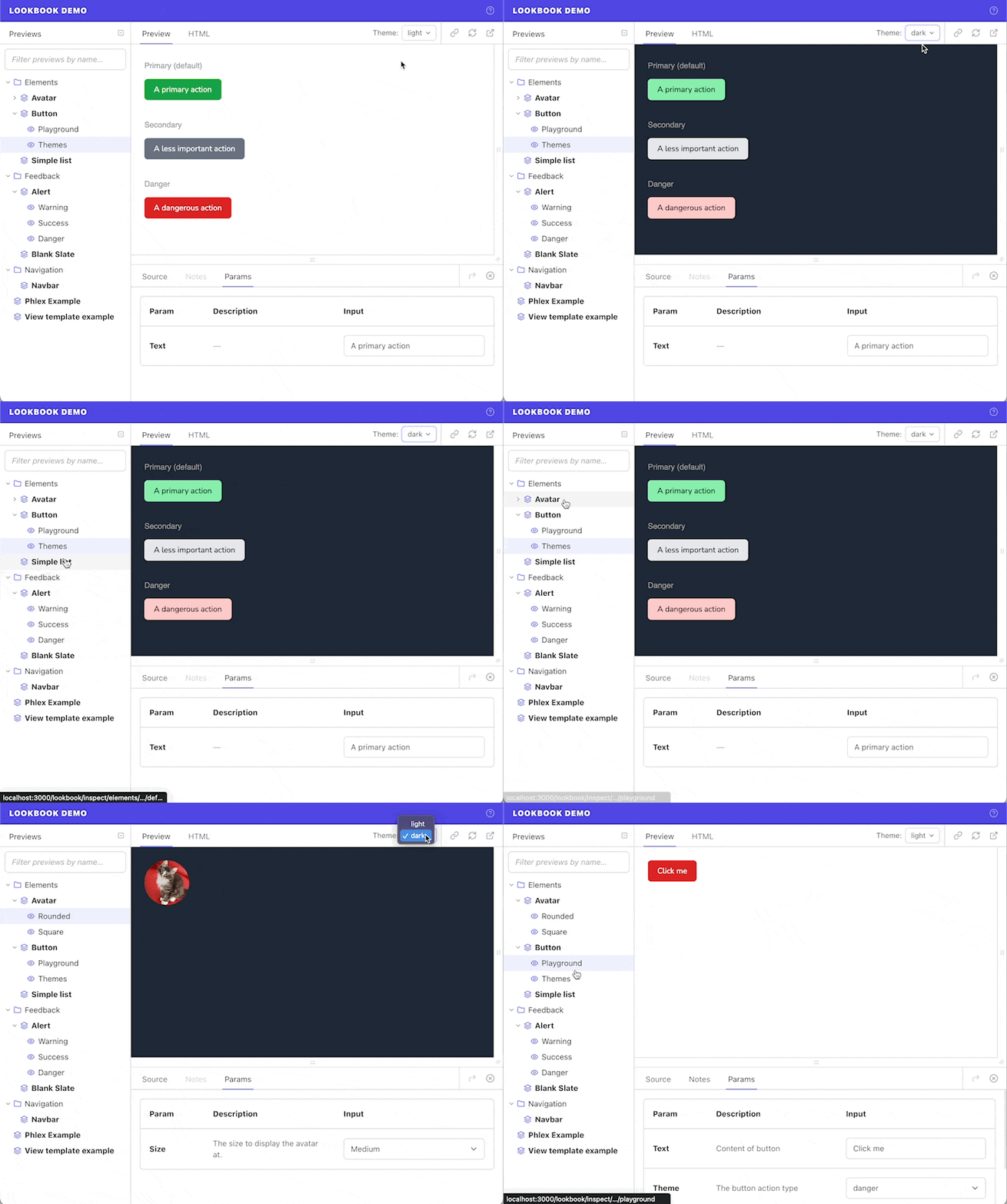
“Dynamic” display options are global, persistent display option values that can be changed on-the-fly in the Lookbook UI.
For example if your app has both a ‘light’ and a ‘dark’ CSS theme implemented, setting up a dynamic theme display option will allow users to easily switch between themes when previewing components.

Dynamic display options are defined in the preview_display_options config (just like ‘regular’ display option default values) but define an array of possible values instead of just a single one:
# config/application.rb
config.lookbook.preview_display_options = {
  bg_color: '#fff', # default bg_color value
  theme: ["light", "dark"], # dynamic 'theme' display option
  lang: [
    ["English", "en"],
    ["French", "fr"]
  ]
}
The array of option choices will be passed through Rails’ options_for_select helper to generate the select dropdown options.
The display option value can then be accessed in layout templates in exactly the same way as ‘regular’ display options:
<!DOCTYPE html>
<html>
  <head>
    <link href="<%= params.dig(:lookbook, :display, :theme) %>.css" rel="stylesheet" />
  </head>
  <body>
    <%= yield %>
  </body>
</html>
Per-preview overrides
If a preview or preview example defines a value for a dynamic display option using the @display tag,
then that value will be used for the current preview and the option-picker dropdown will be hidden on that page.
class FooComponentPreview < ViewComponent::Preview
  # @display theme light
  def default
  end
end
In the example above, the default preview example will set the theme display option value to light and it will not be possible to choose a different theme whilst viewing that preview.
Overridden values like these are not persisted across other previews.
